

01 What it shows
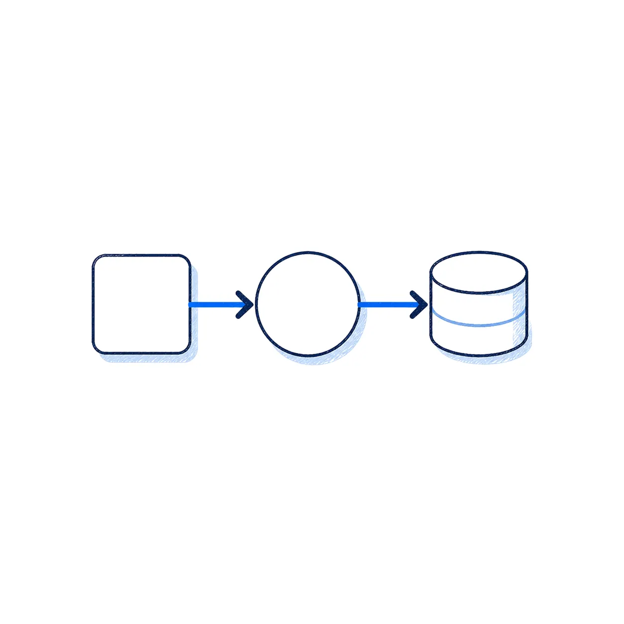
A data flow diagram maps how information enters, moves through, and leaves a system.
Why people ask for it
Reviewers want to understand where data is stored, which systems touch it, and where the trust boundaries are.
02 What a useful diagram includes
Core elements
Sources, users, APIs, databases, cloud services, vendors, and any place data is transformed or copied.
03 Why it matters in real reviews
Practical value
A good diagram speeds up diligence, penetration testing, privacy review, and architecture conversations.
04 The best version
Keep it readable
The best diagram is not the prettiest one. It is the one that helps a reviewer understand the system quickly.
05 A diagram is a conversation shortcut
It exposes the path, not just the destinations
An application architecture diagram might show that a product uses a cloud provider, a database, and a third-party service. A data flow diagram adds the question reviewers actually care about: what information moves between them, in which direction, for what purpose, and under what controls?
That makes it useful when someone asks where customer data is stored, whether a vendor receives it, how an integration works, or where a trust boundary exists between systems.
Start with one meaningful flow
Do not begin by drawing the entire company. Pick a material user journey or product workflow. For example: a user submits data through the application; the application processes it; the data is stored; a support tool may access limited context; and a vendor may receive information for a specific service. Add the systems, arrows, data categories, and external parties that are relevant to that flow.
06 What makes a diagram useful
Show boundaries and ownership
Identify the systems you operate, the services operated by vendors, and the point where data leaves one trust boundary for another. That is often where security, privacy, contracts, and shared responsibility questions become concrete.
Keep the level of detail appropriate
An executive or customer reviewer may need a clear high-level view. An engineer preparing a penetration test may need endpoints, environments, authentication paths, and specific integrations. These can be separate views of the same underlying reality. Trying to satisfy every audience with one dense diagram usually helps nobody.
Update it when the system changes
The diagram is most useful when it is treated as an operational artifact. New integrations, storage changes, vendors, and data uses should trigger an update. That keeps security questionnaires, privacy assessments, and architecture discussions grounded in the same facts.
The value is not the diagram itself. It is the shared understanding it creates before someone has to ask twenty follow-up questions.
Related reading: explore AskDegree solutions when you need execution help, or use the Security Questionnaire Response Plan when a buyer packet just landed.